The inspiration for this months Modern Quilts Unlimited “Everything Old is New Again” Block Challenge was the Lemoyne Star. 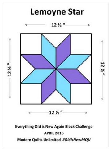 I have a secret to share with you … I’m super competitive. I love to win things and I try really hard to win them. I do “try” to hide my competitiveness because I don’t want to be like that … but I am. If you look back at the winners so far in the challenge most of them have been amazingly intricate pieced block … which likely requires paper piecing and/or lots of patience. If I was going to paper piece I knew I’d have to head over to EQ7 and get to work.
 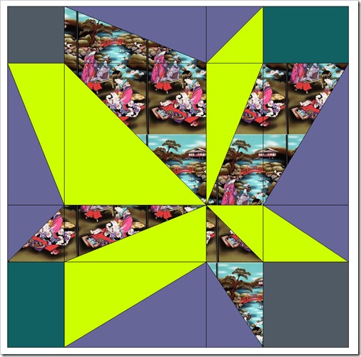 This was my first design … a wonky, off-balance Lemoyne Star. While I think it’s cool and would really highlight the panel print I’ve been using I knew it wouldn’t even contend with the top blocks this month. Back to EQ7 …
 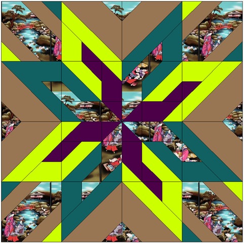 And then this is what I came up with! I think this design has at least a chance to compete for the top spot. I knew my colors weren’t quite matching the ones I’d actually be using but this gave me a good place to start from … and a paper piecing pattern. While this design looks complicated (I think anyway) there’s really only eight blocks that need paper piecing.
 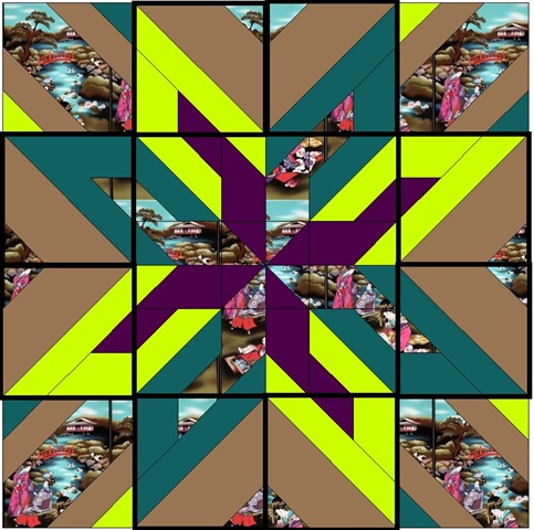 I outlined the eight blocks in the image above in a thicker black line. The little notch of fabric coming into the block makes this one tricky to piece traditionally so I printed out the paper piecing templates from EQ7 to help me get these perfect. I was able to traditionally piece the other eight sections of this block even though there are some teeny tiny pieces in there. I’ll admit … I learned a few things from this block. First – you really have to pay attention to what size block you put into EQ7 as your finished block size before you print out templates. I may have entered that my block was finishing at 10” instead of 12”.
 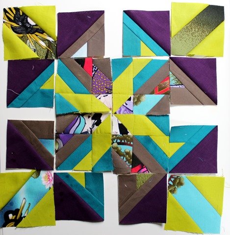 Of course – I was working on multiple projects at the same time in an attempt to be efficient with my limited time at the sewing machine so I finished all eight of my blocks before I realized that they were a half of an inch too small. Crap! To add to that … I had the coloring wrong in the blocks and put the lime green/marine combo on the blocks that should have been Asian tea time panel/taupe. But – instead of throwing them away and starting over I figured that this was meant to happen and I should just role with it.
 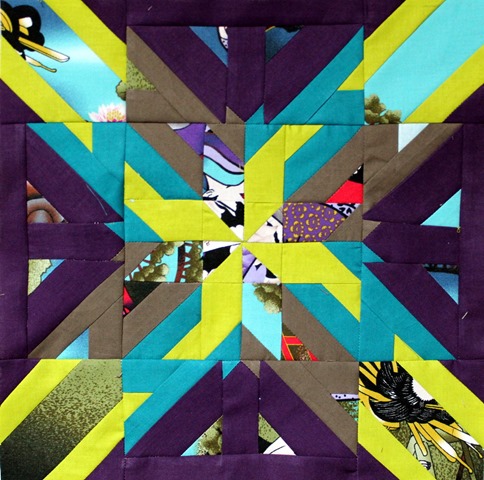 And here is my final block … obviously not the same as the initial design … but I think pretty sweet anyway. To fix the problem I added a 2” x 3” plum fabric strip between the paper pieced blocks. I put on little corners just to add interest and keep with the edgy design I had going. I added another strip of plum to the top of the smaller blocks and before I knew it all the pieces fit together nicely. Hopefully you enjoyed the story of how my block “Dervish” came to be and if you could take a few minutes between May 11th and May 14th to vote for it I would really appreciate it! Just click HERE to do so!

KimLapacek.com | Home of Persimon Dreams and Project QUILTING
Quilt designer, teacher, artist, dreamer
Thanks for sharing your process behind your gorgeous block. I am glad I wasn't the only one that accidentally printed out my foundations too small…but love your ingenious fix! Good luck!!