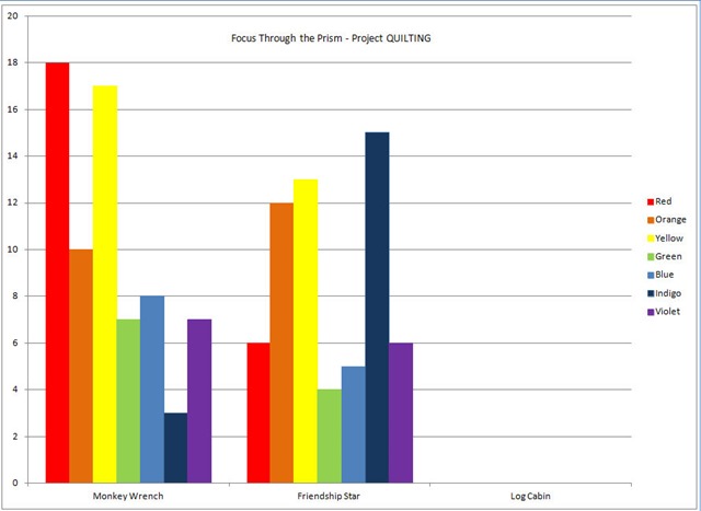
I have a secret. I secretly love excel and all that I can do with it. Since the Focus Through the Prism Challenge has so much to do with color I thought it would be fun to watch which colors everyone is using each month.  I couldn’t decide which format I liked the information in best. Here is the bar graph showing how many quilts were made for each color per challenge.
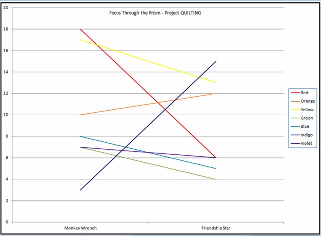
  And here is the line chart that shows how the colors are used in each challenge. Which way do you prefer to look at the data? Or do you think I’m just absolutely crazy?! Don’t worry … I’m pretty sure I’ll keep updating both the charts and graphs as the challenges progress.

KimLapacek.com | Home of Persimon Dreams and Project QUILTING
Quilt designer, teacher, artist, dreamer
Bar Chart. Or maybe a Pie Chart. Mmmm, pie.
Definitely bar chart…and REALLY like the pie chart idea too! Your second diagram was too hard to read. 😉
Definitely bar chart…and REALLY like the pie chart idea too! Your second diagram was too hard to read. 😉
Bar graph for sure! It is categorical data. I LOVE Excel. Have you tried pivot tables?