I can’t say no to a challenge. When the Modern Quilt Guild posted the Michael Miller Fabric Challenge – I was in immediately! 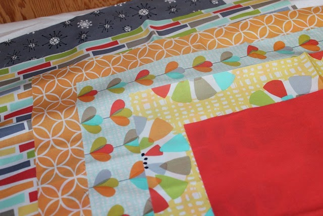 These were the six fat eighths that I was sent to incorporate into my challenge quilt.
 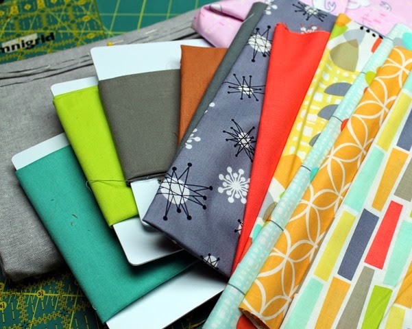 We could add in any solid or Michael Miller printed fabric. I pulled a few of the solids I had that I thought might work with the fabrics. Then I went on the hunt for some Michael Miller prints that I had! I found a great pink narwhale one and later discovered that all my Laura Gunn fabrics are for Michael Miller – score!
 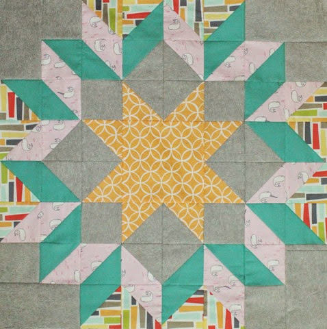 My design all started with the traditional block ‘Dutch Rose’. (tutorial coming soon to craftsy) And after that I tried to think ‘modern’ as I continued to work on my quilt. I will blog more about my entire process later when I ‘reveal’ the final quilt but right now – I have finished six 24” blocks and I need your help! I would love to hear which ‘combination’ you like the best…I’m completely torn at this time and I just need to ‘talk through it’ a bit. I’m looking to you all to leave a comment with your thoughts on which block layout you like best…and if you know why, why? Here are the options… Option 1
 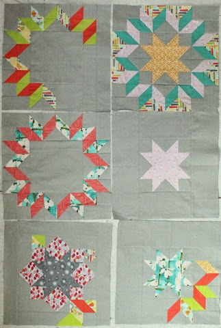 Option 2
 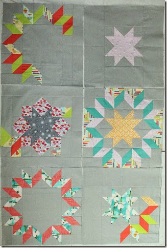 Option 3
 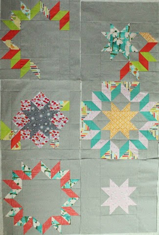 Option 4
 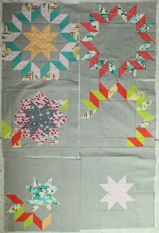 Option 5
 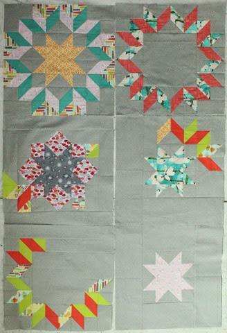 Option 6 None of the above. This is horrible – what were you thinking!? Thanks so much for your help on this…this is way outside my box…but it has been fun to give it a try…if not a bit stressful. Oh – and I’m completely out of the grey fabric so I pretty much have to work with this.

KimLapacek.com | Home of Persimon Dreams and Project QUILTING
Quilt designer, teacher, artist, dreamer
I think I like 5 the best. I might flip it so the star is top left and then it progresses through to a completed star. Kind of like a step by step guide? For me personally, I think option 6. But, everyone has different taste. Mine are just more simple and symmetrical. 🙂 The fabrics are lovely!
Option 5 for me, I like the order of that one.
I kinda disagree with them. I am leaning toward Option 3. Options 5 & 6 and the big stars on top and the little ones on bottom and it's completely off balance. Option 3 is not so "top heavy" and I like the way that the top two blocks play off of each other. Hope that helps!!! It's coming along quite nicely!
I like option 2 the best. For me it has the nicest distribution of color versus background. The deconstruction is not as in your face. You have to think a little bit about what is going on but not as hard as you do in option 1.
The center only star doesn't have enough weight to hold down the bottom of the quilt. Knowing how you mix things up, you might be planning something that lends it the heft necessary to be an anchor. Option 1 would be OK except I think the lower right corner again has a bit of the same problem, not enough gravitas to hold up the quilt. You might be able to flip 3, 4 and 5 to 'fix' the problem I am imagining.
As for option 6, I NEVER know what you are thinking and I am almost always puzzled by your in progress shots. However, I've learned to trust that you have amazing instincts. It always comes together in the end. So go for it and hurry up, As inspired as this step is, I can't wait to see what you really have in mind.
I am really liking option 3. Seems more balanced to me. Looks awesome!
How about 7 I like the parts but not the whole. Its not quite you. It a little plain. Lacks the excitement and vibrancy of your usual quilts …unless these are the basis for additions. I hope this isnt too harsh. Though I like the idea of five turned on point with the light star on the back.
You know I once saw a quilter making very straight forward blocks. They looked fine but they werent doing what she wanted. So she put a plate on them, cut them into circles and raw edged appliqued them done. It turned into a completely different quilt and was really cool. Maybe your thinking too inside the box
Option 3. I like the juxtaposition of the missing parts. Lovely piecing! It's going to be smashing!
I love your first block and can't wait for the tutorial for it. How's that for positive?
I am very impressed with all you have done. I find the block with the white star distracting. It doesn't fit. Love the partials. Modern. Just a little FYI, my challenge is a quilted tote. I had better blog the progress. Good Luck.
I agree the white doesn't hold it's weight. I really like the other blocks. I could see partial piecing added to the upper right corner of the white block and distribution as in 2.
I like option 2 the best because I like the way the top left and the bottom right blocks balance each other out.
I vote for option 2. The color balance of the blocks in option 2 work the best for me.