I’m really happy that by the end of this week we’ll all have six blocks already made for our fun quilt! After this weeks posts we’ll be on our regular schedule of two blocks every other week (opposite weeks of Project QUITLING). With that it’s time for Block 5 of the Home Sweet Home Quilt Along. Before we get to it though, I want to share with you a little about the designer, Terry Aske. Important Links for Terry Aske:
- Web site (Etsy shop): http://www.terryaskeartquilts.etsy.com/
- Email TerryAskeArtQuilts@gmail.com
What is your crafting style? I love working with fabric, especially bright, intense, complex colors. I like to explore various techniques, color combinations and subject matter. How did you get started creating?
My earliest creative memory is from kindergarten, making a mosaic from seeds and beans. I’ve dabbled in many creative activities, including beading, drawing, painting, knitting and sewing. I discovered quilting in 1998, and the design and construction of fabric-based art has become my passion. Do you have a favorite piece? Why is it your favorite? 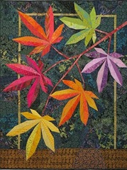 Explosion of Color was my first large non-traditional pieced art quilt. It reflects my love of nature themes and bright colors. I created an original design of Japanese maple leaves, using artistic license to combine various colors that in nature would be found on several different varieties of Japanese Maple. Which part of the creating process does you like the most? Designing my art quilts, and selecting fabrics. When I am working on a quilt, I love searching through my stash to find the ‘perfect’ fabrics. Often, when I’m selecting the fabrics, the colors change dramatically from what I envisioned in the design phase. Which part of the creating process do you dislike the most? The finishing. By the time I get to the binding, sleeve and label, I’m getting bored with the piece, and just want to start a new one. I force myself to finish one before starting the next. Favorite Crafty Blog: http://www.thequiltingedge.com/ <- I often refer to her quilt-as-you-go tutorials, and I love her work. Favorite Adhesive: Steam a Seam Lite Beverage of Choice: red wine Sweet or Salty? salty And I’m not going to make you wait any longer – our next block is here!
“Two Trees" Fusible Applique Pattern
(c) 2012 – Terry Aske Art Quilts 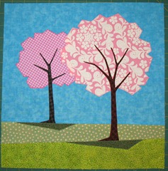 1. The PDF file includes the Master Pattern, and all template pieces at full size, and have been reversed for use with fusible appliqué. The Master Pattern shows the placement of the pattern pieces. If you would like a full-size Master Pattern, enlarge the pattern 150%. 2. Prepare a background square a little larger than 12.5" x 12.5". For the sky piece, cut a square 13" by about 10", for the grass, cut two strips each about 13" by 2.5".
 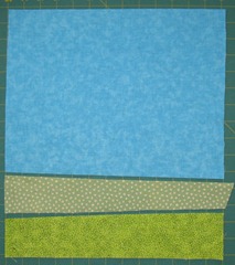 I pieced my background, but you could appliqué by applying a narrow strip of fusible web to the top edge of each grass piece. I made my background about 13" x 13", and trimmed it down to 12.5" x 12.5" after fusing and sewing the pattern pieces.
 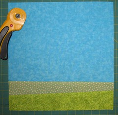 3. Print the template pieces from the PDF file, and trace them on the paper side of your favorite lightweight fusible web. I use Lite Steam-A-Seam, but there are many fusible webs on the market.
 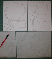 4. Select your fabrics, ensuring there is enough difference in the value (lightness or darkness) of the fabrics, so that the trees stand out from the background. One way to ensure you have sufficient contrast between your fabrics is to view them from a distance. Another is to photocopy them in black and white, or use photo-imaging software to preview them in black and white. I do this with scraps of fabric before sewing them together.
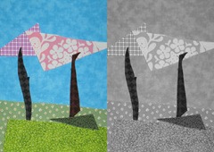
- Tree foliage – I used pink fabrics for my tree foliage to represent Spring blossoms, with a darker pink for the smaller tree and a light pink for the larger tree. You could use Summer greens, Autumn colors, or any other color that appeals to you, but ensure the two trees have different patterns and values, so they don’t blend together from a distance.
- Sky – I used a medium blue for my sky, ensuring it was sufficiently darker than the tree foliage fabrics for good contrast. If you use medium or dark fabrics for your tree foliage, you could use a lighter fabric for the sky.
- Grass – The grass in the background should be lighter or less vibrant than the foreground grass, to give the illusion of depth.
- Shadows – the shadows should be quite a lot darker than the grass, but similar in color.
- Tree trunks – use a dark fabric for the trunks.
5. Cut the fusible web about 1/4" outside the traced lines. Fuse the pieces to the wrong side of your fabrics following the manufacturer’s directions. Cut out each piece along the traced lines. 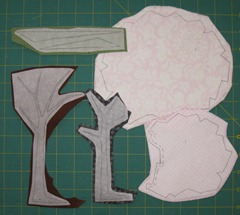 6. Remove the paper backing, and arrange the fabric pieces on the background, referring to the Master Pattern for placement. They don’t have to be exactly in the same position as the Master Pattern. Position the foliage first, then the tree trunks, then the shadows. Ensure the foliage for the smaller tree is under the larger one. Ensure the trunks are positioned so the bottom is slightly under the shadow, and that the shadows are lined up with the edge of the grass. Play around with the positioning until you are happy with it, then fuse all pieces to the background following the manufacturer’s instructions.
 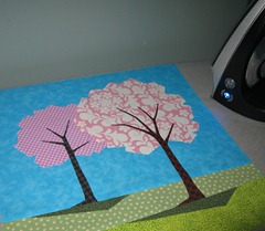 7. Stitch the edges of each fused piece. I used a narrow zigzag stitch and because the pieces were fused did not require a stabilizer. Trim block to 12.5" x 12.5". (photos 7 and 8)
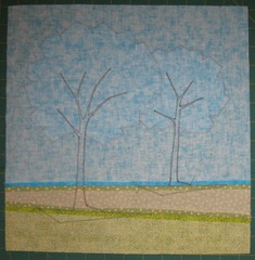
Click HERE for a printable PDF pattern!
Don’t forget to add your picture to the flickr group once it’s complete: http://www.flickr.com/groups/1850682@N20/

Love these trees – they should be great fun to make!
Hello,
The trees are beautiful, but The last photo from the tutorial I cant see. Please can you look after it and fix it??
Greeting Guilitta