 The Challenge: http://kimlapacek.com/2011/02/project-quilting-season-2-challenge-4.html
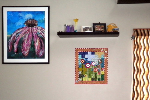
 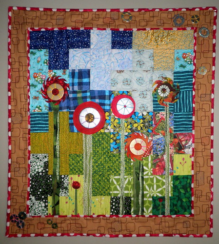 What the Judges Had to Say: Judge 1: This is adorable. It is going to be an easy sell on Etsy if that is what you choose to do with it. In your story you state the washers are pretty literal but sometimes that is a wonderful solution to a great piece. I am with you; I love the mix of the metal and the fabric. Another element of this piece that I find unexpected but love is the look of the polka dot fabric on the inner border and the binding. It so well echoes the flowers and makes them stand out. Great job again, Kim. I love it!
 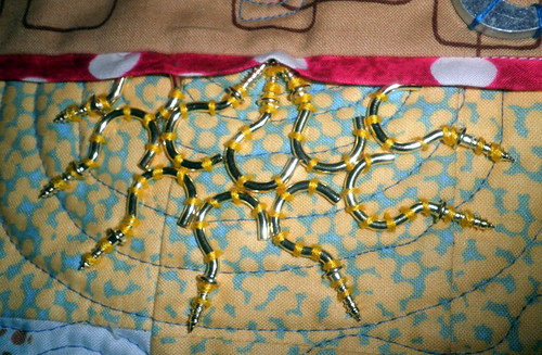 Judge 2: You are so creative. The hook sun is inspired. Love the saw blade flowers with the washers stitched on in a way to give them extra dimension. You’ve added just enough washers to the border. I really like the quilting you did in the border. Kind of a minimalist approach using the pattern that was already there. You used the right colors in your plus sign background to give the garden background your flowers needed. Love the mini flowers. The difference between you and so many others is that you have the vision and courage to use red polka dots in a project like this. It would never occur to most people and adds so much more life that a plain red would.
 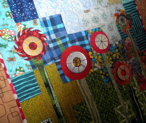 Judge 3: Very colorful & bright with lots of things going on – just like a hardware store.
 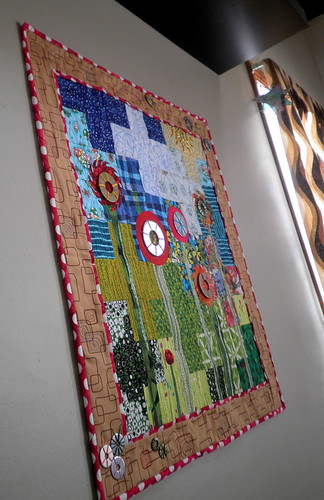 Judge 4: Your design does a fantastic job of using hardware elements like saw blades and washers and transfiguring them into fabric elements. Adding the metal washers afterwards doesn’t end up seeming too literal and gratuitive, because at that point the metallic’s provide a complementary sensation, instead of stealing the focal point. Metallic’s and fabrics are a wonderful contrast, and you’ve shown on many occasions that you know how to balance these for optimal effect. Your choice of the red & white polka dot border and binding fabrics was a brilliant punch to complement the red dots of the flowers. And using the washers only in opposite corners gives movement to the circular design as it draws the eye upward – a symmetrical treatment in all corners would have failed to give that energy.

KimLapacek.com | Home of Persimon Dreams and Project QUILTING
Quilt designer, teacher, artist, dreamer
Leave a Reply